Shiney Hiney's Rebrand
About Shiney Hiney's
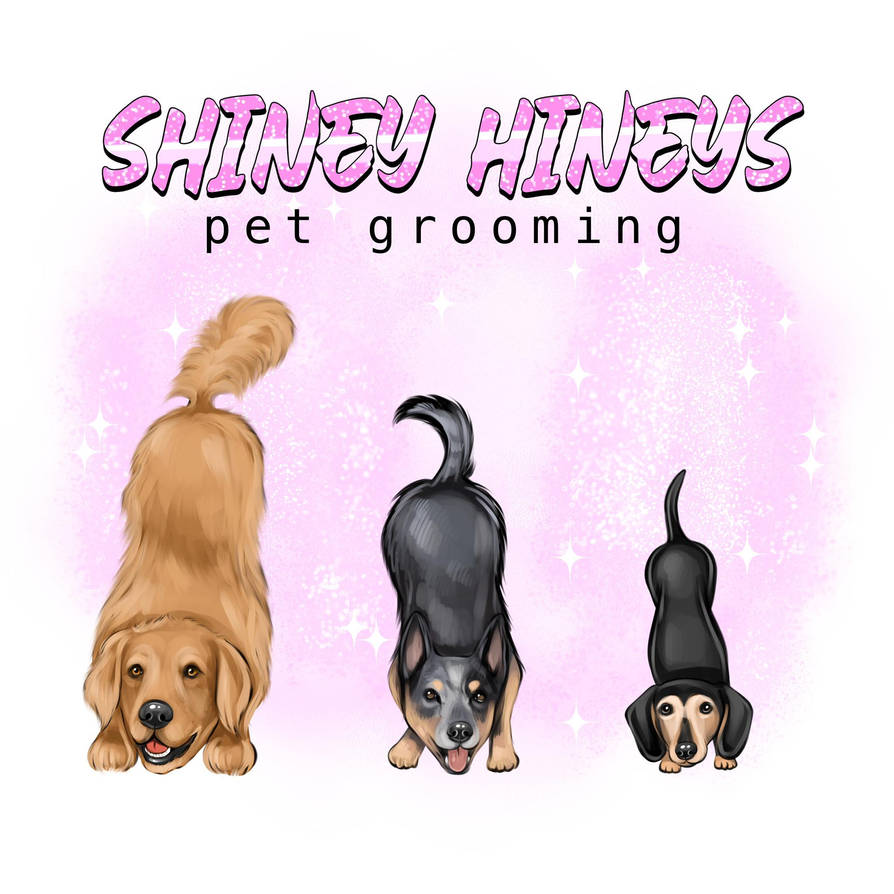
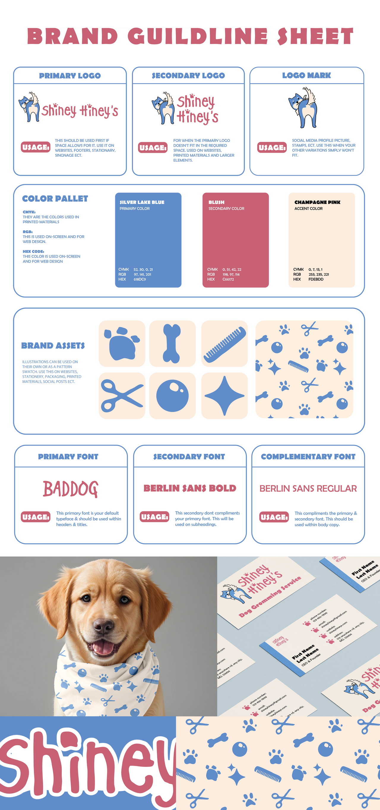
Shiney Hiney’s is a small, local pet grooming shop based in Baltimore, Maryland. Currently, the business has little to no established branding. Their existing logo is a detailed illustration of their three dogs with their backsides in the air. I took this as an opportunity to challenge myself by developing a refreshed brand identity that would help the shop appear more professional and official.

Idea and Assests
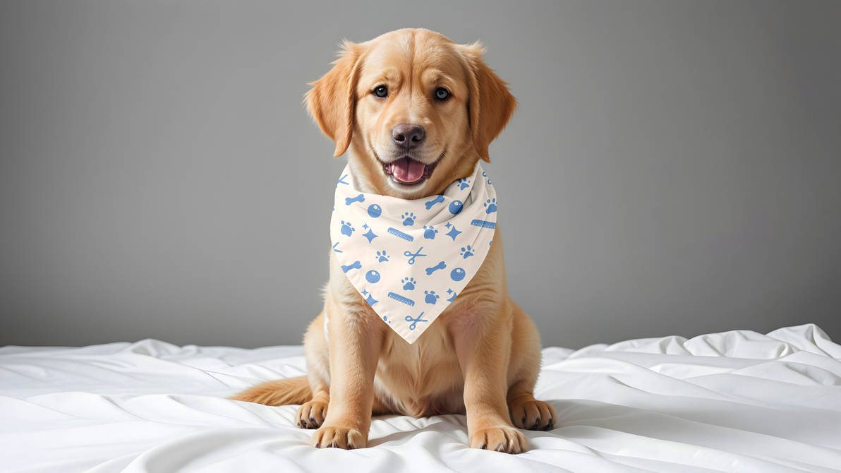
I designed the logo featuring the back view of a dog to directly tie into the shop’s name while also reflecting the fact that Shiney Hiney’s services dogs. To further connect the branding to the grooming experience, I added a bandana, which references the bandanas placed on dogs at the end of their grooming sessions. For the color palette, I chose blue to symbolize cleanliness and pink to represent the warm, welcoming atmosphere of the salon, as well as the care they provide for their clients’ pets.
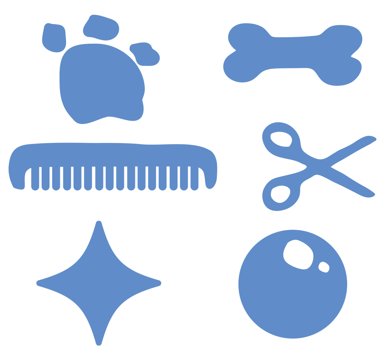
After finalizing the logo, I created a set of additional brand assets to support the visual identity. These include illustrations of a bone, comb, bubble, scissors, paw, and star—elements that directly represent a dog grooming business. The illustrations were designed to function both as standalone icons and as pattern swatches, making them versatile for use across websites, stationery, packaging, print materials, and social media. I gave the assets an organic, hand-drawn style to reflect the brand’s personality: a little playful and imperfect, yet reliable and approachable.
Mockups
To bring the branding to life, I created a series of mockups to visualize how the identity would work in real-world applications. The first mockup was a branded bandana on a dog, reflecting the shop’s actual grooming process where every dog receives a bandana at the end of their appointment. This allowed me to see how the logo and supporting assets would translate directly onto a product closely tied to the customer experience.
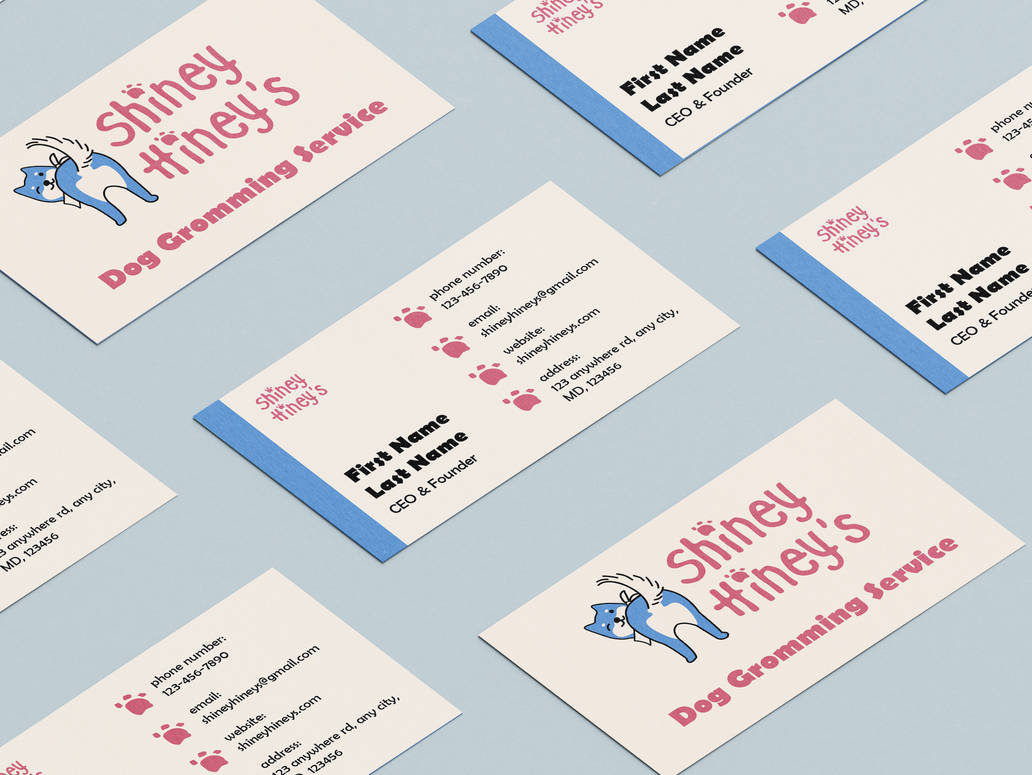
In addition, I designed a business card mockup to demonstrate how the branding could extend into client-facing materials. The card not only serves as a professional contact piece but could also be adapted into an appointment reminder card, helping the shop establish consistency in both branding and customer communication. By exploring these applications, I ensured the visual identity feels cohesive, functional, and aligned with Shiney Hiney’s brand voice across different touchpoints.
 Go back to projects